BARONESS’ JOHN BAIZLEY ON CHAOS AND SECRETS OF ‘GOLD & GREY’ COVER ART via Revolver

Inspiration struck in John Baizley‘s bathroom.
The artist and Baroness frontman had spent another day in his studio trying and failing to figure out how to make the color orange work on the group’s next album cover. “It’s the most gaudy hue that is available,” he explains. “It’s 100 percent why we haven’t done that color yet. We kind of saved it for last.”
Over 3,700 miles away — the approximate distance between Philadelphia and Amsterdam — artist Marald van Haasteren (High on Fire, Klyesa, Wolfbrigade), who recently created stunning Ghost-inspired artwork for Revolver and had previously collaborated with Baizley on Baroness’ last album, 2015’s Purple, was having a similar experience. “It’s one of my least favorite colors of the spectrum,” van Haasteren reveals. “Over here in the Netherlands, it’s associated with our King and soccer team — not the kind of things I’m fond of.”
While both artists struggled with this color, diehard Baroness fans knew that orange would complete the color wheel of the band’s album covers and so Baizley and van Haasteren were determined to find a way to make it work.
One day he had a breakthrough. “I was going out to see a show, brushing my teeth in my bathroom before I went out,” Baizley recalls. “The walls of my bathroom are this sort of warm, neutral gray. I had a pack of Trident — like an orange, mint-flavored gum. As I lifted the package out of my pocket, I saw that package with the walls behind it. The color combination was so intriguing. It just hit me like a ton of bricks. I said, ‘This is the way to do it. There’s a gray element.'”

Baizley in his bathroon explaining the “lightbulb moment”photograph by Jimmy Hubbard
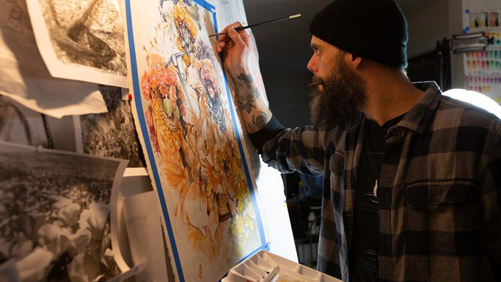
With this idea in mind, Baizley set out to create what he describes now as “the best [piece of visual art] I’ve done,” and van Haasteren started 21 original pieces to accompany the album packaging, of which he says, “The biggest challenge with this album was not matching John’s quality, but actually surpassing the standard we both set with Purple.” He adds, “I truly believe we achieved that and then some.”
Finally, in mid-March, Baizley unveiled his creation after some Pantone number teasing via social media that revealed the new album’s title: Gold & Grey, despite all the orange in the cover painting. Baroness’ highly anticipated fifth album and first LP to feature guitarist Gina Gleason is due June 14th via the quartet’s own Abraxan Hymns (you can pre-order it here); ahead of its release, Revolver caught up with Baizley as he walked around Disneyland looking for a quiet place to talk about the intense, gorgeous art and all the complications and chaos that went into creating it.

one of Baizley’s sketchescourtesy of John Baizley
DID YOU CONSIDER CALLING THE ALBUM ORANGE?
JOHN BAIZLEY Up until I think the day before we mastered the record, we were calling it Orange. We assumed that’s what the title was going to be. I was at a loss for how to call it Orange — I didn’t think it was going to be a good title. It doesn’t roll off the tongue. It doesn’t give me a good image.
Right before we went into master, I was listening to our record and I noticed there are several lines of lyrics that either say “Gold & Grey,” rhyme with it or sound very similar to that phrase. In a way, I think it would be cool if everybody still referred to it as Orange, but Gold & Grey seemed like a more sophisticated way of putting it. It was, honestly, a lot more on-message with the album. It’s a fairly long album. It’s not a double record, but that dual-titling thing seemed appropriate.
ARTISTS DON’T LIKE WORKING WITH ORANGE. CAN YOU EXPLAIN WHY THIS COLOR IS SO HARD TO WORK WITH?
It’s a difficult question and a difficult answer. So the wavelength of red is the most powerful and potent color. When light reflects off a surface that our human eyes interpret as red, the wavelength is a very long sine wave. That’s why stop signs are red. Yellow, in terms of primaries, is kind of a close second, because it’s a very bold color. Red and yellow can be very warm colors. When you mix those two colors together, you get orange.
We see orange in nature infrequently. Yeah, there are flowers that are orange, tiger lilies. There’s a handful of birds. As you mix down orange from a pure hue to something more neutral, it just turns into brown. Really, brown in nature is the orange of nature. But who wants a brown album cover? Nobody. [Laughs]

one of Baizley’s sketchescourtesy of John Baizley
But what I’ve found is that in modern society, we use orange primarily to denote something dangerous. That’s why traffic cones are orange. They wouldn’t be as visible if they were red, and they wouldn’t be quite as powerful if they were yellow. Orange falls in this zone of color that, when you look at it in a very pure hue that’s not toned down, it’s just loud. It’s incredibly loud.
It only works in certain situations. The difficult thing, even for artistically inclined people and for people for whom color theory is easy — and it’s not for me — orange is a tricky one to work with because you have to balance the right amount of other colors around it in order to make it visually appealing. It’s just a stain. Whenever I see the orange flames on stupid rock albums, it’s a huge turnoff. Obviously, I don’t want to make an album cover that’s based on something I consider gaudy. Balancing it with gray seemed to be the way to make it as an accent color more than just making everything look like it was dipped in some sort of orange dye.
YOU TOUCHED A LITTLE BIT ON WHY IT’S NOT TITLED ORANGE — BUT WHY NOT, LIKE, ORANGE & GREY?
The actual color orange doesn’t bring any specific emotion. In my mind, gold has elements of orange in it. It has elements of yellow, it has elements of orange. But you would say, as the sun was setting, that it, literally, casts an orange hue on the planet. [Yet] we call that a “golden sunset.”
It wasn’t difficult for me to make that leap. There is an artist, Caspar David Friedrich. He did paintings that I was very enamored with when I was younger. He had done this painting of the ruins of a church that was the sunset period of the day, as the sun is setting, it casts a shadow on half the building. The lower half of this building he was painting is dark. The upper half, where the sun still shines its rays and doesn’t cast a shadow, it just immediately transitions into that sort of golden hue.
There was also some poetry to Gold & Grey. They can usually be seen as polar opposites. Gold is something that’s regal, it’s beautiful, it’s valuable. Gray, more traditionally, is drab and can be seen as a boring or lifeless. For me, it was about balancing the idea of something halfway in between dark and light versus something that really had an emotional response.
WHICH WAS …?
I’ve always been this firm believer that, based on my experience with life and the things that I struggle with, that my reality, which isn’t always entirely pleasant — more often than not, it’s entirely unpleasant … I don’t choose to see those dark moments of my life as being “black” moments, and I don’t choose to see the rare moments of exultation and pure joy as “white.”
The analogy that I use is, if you take a realistic world view of our human experience, the beauty lies in those shades of gray. Black and white? That’s reductive and simplistic. It doesn’t work for me when I’m trying to understand myself. The extremes are things that I cut out of the picture. I try to focus on, for lack of a better term, the shades of gray in my life.
Obviously, the idea of gold as being something that’s reflective, that has an inner light to it, offered the contradiction that I was looking for. It can be very easy to reduce life, music, art, love, loss, anything, to the simplistic terms. Microscopically, nothing’s perfect and nothing is intrinsically flawed at its core. From a philosophical, conceptual standpoint, I want to look at things like that. That’s how I found self-improvement through my art. At this point, I draw very little distinction between the sonic side and the visual component of what I make.
Below, Baizley opens up for our “Rise Above” series about how art has helped him overcome tragedy and anxiety:John Dyer Baizley: Rise Above Ep 1
Volume 90%
CAN YOU EXPLAIN THE WAY YOU SETUP YOUR ARTWORK? I KNOW YOU HAVE A PARTICULAR WAY OF DOING IT.
There’s a north/south axis of our albums — in other words — the top half and the bottom half. I choose to use the bottom half of an image as representation of earthly things. You know — physical things, things that are grounded, potentially more literal, substantial, physical. The top half tends to represent, symbolize and imagine the things which are more conceptual, ethereal that have more to do with the spirit and the soul. Where things are located have significance. Furthermore, I have always considered the images that I make representations of archetypes, right?
Well, the female figures aren’t … it’s not important that they’re figures. It’s not critically important that they’re female. It’s important that they represent archetypal ideas. In other words, we, as a species that have existed for a very long time, [we have] images that we’re genetically pre-loaded with. There’s always going to be a floral element — that’s the natural world. There are typically animals, that’s the fauna side of things. They’re a counterpoint to the plant aspect. Then, there’s the female figures and there are the adornments on the female figures.
I HAVE NOT SEEN A PICKAXE BEFORE IN BARONESS ART. WHY DID YOU WANT TO INCORPORATE THAT TOOL IN PARTICULAR? WHAT DOES IT REPRESENT TO YOU?
It’s become more important in recent years that I include an element that has the idea of potentially being an implement of danger, whether it’s a weapon or a tool. Something that can be destructive, but simultaneously has a use in a constructive way. For instance, on Yellow & Green, the figure on the front is holding a knife up to the swan’s throat. It seems like the moment before a violent action is taking place. But we all know that knives are also used to prepare meals, which are, like, the ultimate communal experience.
The idea of an image that occurs in that split second before everything goes absolutely haywire — that moment before the bomb explodes, that moment before the car crashes, that moment before our lives pass on — I think that’s a really potent moment. I happen to have lived through several of them, and they clearly have left quite a distinct impression on my psyche. The pick is there for that reason.

details of the ‘Gold & Grey’ artworkphotograph by Pam Strohm
I’ll spell out a few of the things that I’ve hidden in this cover. If you look up the handle of the pick, there’s a pattern that’s etched into the wood — those are the pods from poppies. I found the very first image that I ever made for Baroness for a show flier. It is this skull with a gigantic poppy at the top of it. I realized that I have been very obsessed with that flower and its symbolism since I engaged in making symbolic art.
Then, at the top of the pick, if you focus on the center point of it, there’s a design that looks like it’s been burnished or etched into the metal. That is a cross-section of an orange, which is just kind of a joke. Like, just in case you thought we hadn’t considered calling it Orange, I want you to know, there is an orange there! [Laughs]

details of the ‘Gold & Grey’ artworkphotograph by Pam Strohm
I know I take everything so freaking seriously and I intellectualize things to a degree that’s not necessary. But I do try to include some inside jokes and I’ve always tried to bring some element from every member of our band and put it into the album cover so that it never feels this is just, like, a one-man show. Artistically, I want to make sure that our audience is aware that this isn’t about my art, this is about our art. It’s about our shared experience. More importantly, it’s about the experience that we share with the people who are adventurous enough to call themselves fans of the band.
The pick relates, as I said, in that way where it’s seemingly more dangerously portrayed on this album cover than it would be, maybe, if you just took a photo of somebody actually using one. It also is just a pre-historic tool. It’s one of the first things that Homo sapiens invented to accomplish greater things. It’s a tool for craftsmen, but if you want to get nasty with it, you could do some real damage to somebody with one of those. It’s there to present that contradiction.

details of the ‘Gold & Grey’ artworkphotograph by Pam Strohm
I CAN SEE HOW IT RELATES TO THAT BALANCE BETWEEN GOLD AND GRAY BECAUSE, THE TOOL ITSELF, YOU DIG WITH IT AND ITS COUNTERWEIGHT CAN HELP YOU PRY WITH EASE.
You put it in the way that I was trying to avoid putting it. [Laughs] But, yes. Digging, to me, represents looking inside. When I look inside, it’s not a pleasant experience. It is a necessary experience. That’s why that’s there. There’s also a personal angle to it that relates to the teeth. Clearly, you can pry teeth out if you want. I wouldn’t do it with a pick, but who am I to say.
YOU AND MARALD VAN HAASTEREN COLLABORATED WITH PURPLEAND YOU DID AGAIN FOR THIS ALBUM? HOW DO YOU GUYS RELATE, ARTISTICALLY?
Working with Marald has become a very critical part of my process. I think Marald’s one of those kindred spirits with me, who enjoys the act of making figurative work. He is also one of those people who considers what he’s doing more than mere illustration, more than commercial design. He draws specific images with specific purpose in mind. He’s been a great collaborator with me, because we really challenge each other technically and conceptually. What we do together, I think, forms this sum that’s greater than its parts.

Marald van Haasteren (right): “John freaking out over my originals in a hotel room during Roadburn festival”photograph by Jimmy Hubbard
IT SEEMS THAT, MORE THAN A WORKING RELATIONSHIP, YOU GUYS HAVE A VERY COLLABORATIVE, ARTISTIC FRIENDSHIP.
I feel it’s important to recognize that. I’m not the sort of person that hires talent. I work with people. People do not work for me. Everything I do, I like to consider collaboration. I think it’s an important example to set in this day and age. It was something that was important to me growing up, both as an artist and as a musician. Having creative people to drive you, is possibly the greatest gift that we, as artists, have.
So his artwork is absolutely quintessential to what Baroness has done to this point. He’s been fantastic to work with. Marald, he is a member of the Baroness family — practically a member of the band, he just doesn’t play an instrument.

photograph by Pam Strohm
HOW DO YOU FEEL COMPLETING THE COLOR CYCLE WITH BARONESS?
[Pauses] I have very mixed emotions about it right now. It’s been such a huge part of the past 12 years of my life that sending it off and feeling like I’ve finished something is a really daunting concept for me. With everything else, I feel like this band is just continuing to evolve. It’s such a big part of me at this point, that it’s really hard for me to let go of that idea. It’s also really necessary, because it’s been exhausting to have stuck to such a particular idea for such a long time. To be working on one concept for 12 years, it’s ridiculous. But that’s also is how I do everything.
THERE’S A LOT TO UNPACK IN THE FINAL PIECE, BUT I THINK I SEE AN ELEMENT OF EACH OF BARONESS’ PAST ALBUMS?
I did work in every album cover in a conceptual or literal way on this cover. In fact, I’ve included one of the primary images from each of our former records into the package for this. You have to find them. Some of them are easy to find, some are more difficult. Then, simultaneously, I’ve actually made the color wheel happen in a sequential way — twice. I don’t know why I did it. It was unnecessarily complicated and difficult to do. This record itself has so many hidden elements across the course of those 17 tracks that I couldn’t articulate them all. Similarly, with the artwork, I kind of ended up going pretty deep on that, as well.
WHY DID YOU GET SO DEEP WITH THE ARTWORK?
I don’t know … I think I just need to say it to someone — making this record was the most difficult thing I’ve ever done. I wasn’t in a particularly good place when I started it because I started it way too late and I took longer than I thought I was going to take. I obviously spent a couple hundred hours on it. It’s not necessary to do that, but I do that compulsively. It sucks. Things were relatively dark for me at the time when I started it. My idea, initially, was to do something simple and effective that had, like, a more immediate and direct presentation.
I thought I was doing that — until the last day of making it. I stepped back from the easel and I was looking at the artwork and it struck me how complicated, chaotic and overwhelming the amount of imagery, technical aspects and color that I used.

photograph by Pam Strohm
I just spilled out onto the paper the chaos and compulsion that I was trying to avoid. It didn’t hit me well. I love the artwork. I think it’s great. I think the best thing I’ve done, but I didn’t know … I was operating on such an instinctual level with it. I stepped back and it terrified me. I never knew that I was doing that. I literally didn’t.
It showed me how little control I have and it was the exact same feeling I had when mixing the record. I realized how over the top everything was, you know? That’s what the record’s about, I think. That’s what the artwork’s about. It’s about the contradiction between the gold and gray, but the contradiction between me trying to find out who I was and realizing, when I was done, that it’s complicated.
You know, maybe, the lesson is my hands have never really been on the wheel… It’s coming from my heart, through my hands, onto the paper, through my instruments and out into the world. I have no control over it. I guess I should just stop caring about that and just let that path guide itself.
WELL, THAT GOES BACK TO WHAT YOU WERE SAYING HOW YOU CANNOT SEPARATE THE ART FROM THE MUSIC. IT’S BEEN YOUR LAST TWO YEARS, MENTALLY AND PHYSICALLY.
You know, when I hear you say it, then it sounds good to me again. I’m going, OK, well, if art is self-expression, then I have expressed something that I’m positive is genuine. It is not up to me whether or not it’s good. The world at large gets to make those decisions.
I don’t consider myself a role model, I’ll preface by saying that — but if there’s any advice or that I could articulate to other artists or musicians is that if you’re not sacrificing every ounce of what you are for your art, you are not creating the most genuine sense of art that you’re capable of creating. Sometimes it’s ugly. Sometimes it’s truly ugly. Sometimes it’s truly horrifying. I’d like to think that at the end of every project that I’m a part of, that I can at least say, quality aside, I did not compromise. I did not lie. I did not cover up facts. But here’s my experience. Here’s what I am. Here’s what I’ve been through. Take it or leave it, but it’s real.

the final, entire ‘Gold & Grey’ artwork


